WegWeiser

Year
2022
Role
Field & User Research, UI Design
Wegweiser is a system designed to help users navigate through airports through a gamified mobile application.
The Solution
For the most part, the wayfinding experience in an airport environment is a self-guided journey. Airport environments can create some very complex navigational challenges. Therefore, the role of a well-planned wayfinding system is quite extensive.
The purpose of the guideline is to facilitate the safe and efficient movement of passengers within each airport and from one airport to another through the uniform application of wayfinding best practices and common design criteria.
Airports are complex places, with a lot of different people and agents moving around. This can make it difficult for passengers to know what to do in different situations.
The Problem


Signs & Signages
In the world of signs, there are thousands of different types and variations designers can use to take a storefront or building to the next level.
The directional signage is used to help people find directions. These display boards are placed by the roads and buildings and make it easy for people to travel, find and access different locations.
Poppins Devanagari design is particularly new, and is the first ever Devanagari typeface with a range of weights in this genre. Just like the Latin, the Devanagari is based on pure geometry, particularly circles.
सुरक्षा जाँच
सुरक्षा जाँच
Matter is a grotesk typeface with a subtle, warm touch. This is caused by lively forms and diagonal terminals. The vertical terminals still have some angle even when it seems there is not.
Matter SemiBold
Matter Medium
Matter Regular
Matter Light
Matter Bold
Matter Heavy
सुरक्षा
Security
100%
70%
सुरक्षा जाँच
Colours
The airport navigation app embraces a vibrant palette. Energetic orange sparks engagement, while calming blue ensures trust. Clean white brings simplicity, yellow enhances visibility, and sleek black adds sophistication.
Sunglow
Orange Red
Black
White
Blue film
Black
08
Grey
19
Orange
34
Yellow
71
White
85
Red
13
Blue
15
Green
17
Example
Text colour: Black ( 8 )
Background colour: Red ( 13 )
Conclusion - Insufficient contrast
{
13 - 8
13
× 100 = 38
}
TEXT
Text colour: White ( 85 )
Background colour: Red ( 13 )
Conclusion - Sufficient contrast
{
85 - 8
85
× 100 = 84
}
TEXT
Light Reflectance of Colours
Colors with higher light reflectance percentages reflect more light and appear brighter, while those with lower percentages absorb more light and appear darker.
K1 = Highest colour value
k2 = Lowest colour value
H = Contrast value
Optimal contrast value is at least a hue of 70
In wayfinding contrast is important for ease of reading
{
K1 - K2
K1
100
×
}
= H
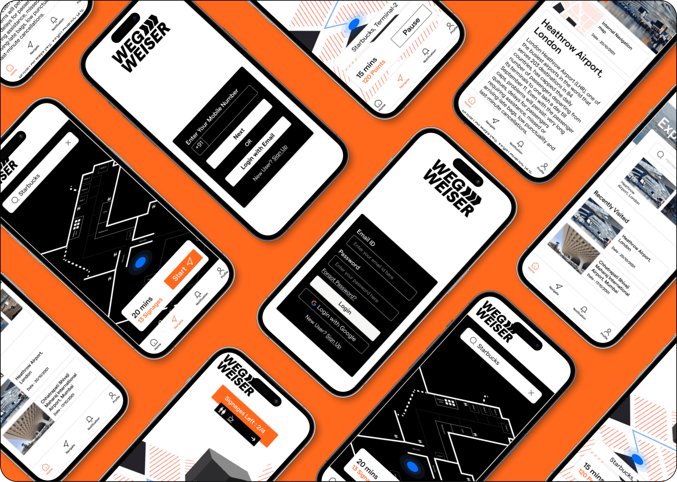
App Flow
After logging into the app, the users will reach the Home screen where they will be able to view all the recent airports they have visited along with some information
The users will have options to go to the navigation page or the Profile page.
In the Navigation page, the users will be able to enter the destination they want to go to in the airport and the app will guide them accordingly


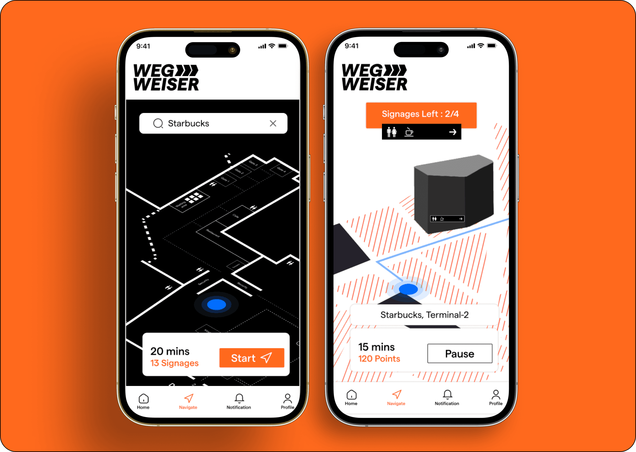
Gamification
Enter your destination, hit start, and let the app seamlessly guide you through the airport to places like Starbucks. Earn points as you pass signage, accumulating rewards for exclusive offers.
Enjoy stress-free travel, effortlessly reach your destination, and savor perks with our intuitive navigation and point redemption system.
Travel smart, earn points, and unlock a world of convenience.